Transforming the business, reshaping consumer perception through brand image.
Background
Founded in 1998, Wahana emerged as an early pioneer in the modern logistics landscape within Indonesia. Originating as a humble enterprise in Surabaya, Wahana have since evolved into one of the nation's most expansive and far-reaching logistic networks.
In the pivotal year of 2018, Wahana embarked on a strategic reevaluation of its brand direction, prompting the need for a comprehensive rebranding effort that authentically mirrors this transformative journey.
The new identity mirrors the contemporary essence of Wahana, encapsulating the ethos of its approachable and cost-effective services while simultaneously elevating its professional image. Several elements within the logo draw inspiration from the previous identity, skillfully transforming them into a more modern and polished representation.
This transformation instills confidence in Wahana's customers, encouraging them to engage with the company and explore the full spectrum of the services. Bolstering this evolution is the fresh brand tagline, "Hemat. Cepat. Bersahabat." which seamlessly integrated into the communication and promotional materials to effectively convey the brand's core message.
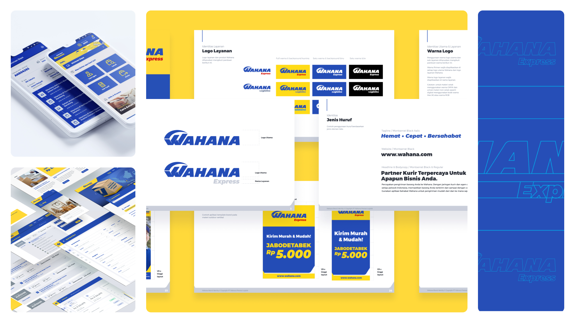
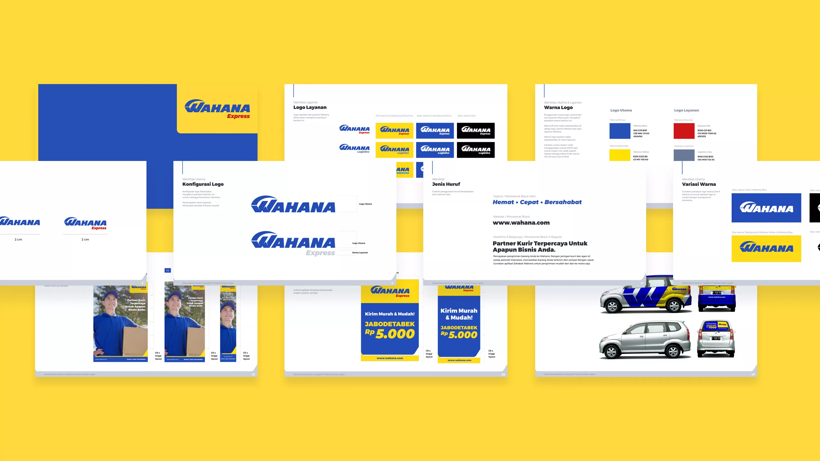
The Logo
The logo is meticulously crafted with precision, following the principles of the Golden Ratio. This deliberate approach ensures its legibility and impact across all forms of communication, promotions, and digital materials. In contrast to the previous logo, we have embraced a bold custom sans-serif typeface that impeccably mirrors Wahana's fresh and dynamic image.
The distinctive blue and yellow color combination has long been synonymous with Wahana. The new brand identity proudly inherits this iconic palette, though it has undergone a comprehensive transformation. This recalibration is aimed at seamlessly aligning with the new strategic direction, as well as adapting flawlessly to various mediums and implementations, with a special emphasis on digital media.
Unified Visual Identity
In addition to revamping the logo, the new identity extends its transformative touch to encompass all visual facets, spanning the spectrum from company collaterals, advertising materials, communication channels, and digital platforms. This holistic approach is instrumental in cultivating a seamless and resonant visual identity, fortifying the brand's image, and tailoring them with precision to meet the contemporary demands of today's discerning consumers.